Centering things: a solved problem?
In Chrome and Edge, the following code can be used on block layouts to center child elements:
.container {
  align-content: center;
  justify-items: center;
}
align-content works without the need for flexbox or grid — and it works in all browsers!
See the Pen center without grid or flex by Ollie Williams (@cssgrid) on CodePen.
justify-items on a parent element and justify-self on a child also work without flexbox or grid, but only in Chromium for now.
See the Pen Untitled by Ollie Williams (@cssgrid) on CodePen.
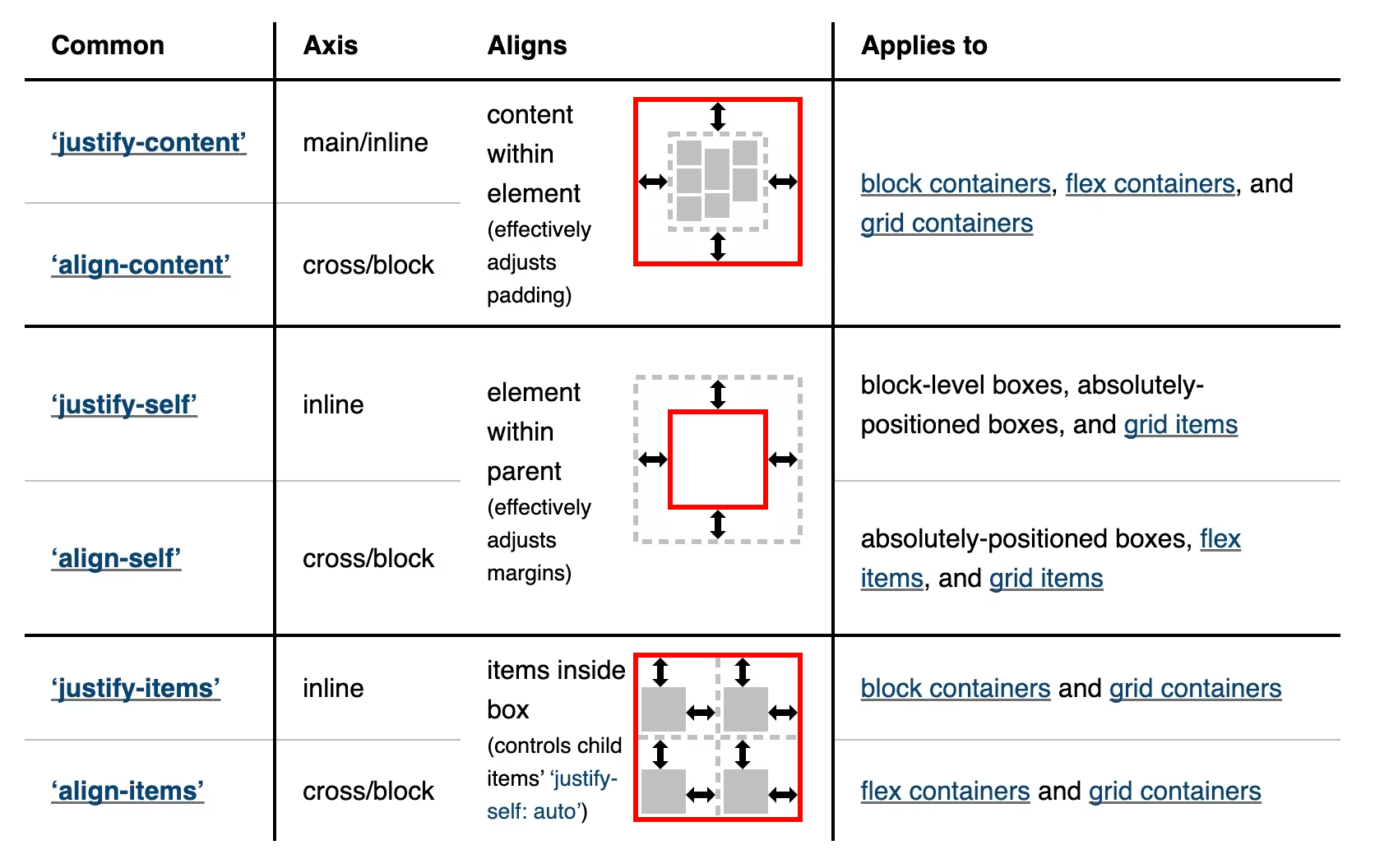
Here’s a handy table from the CSS Box Alignment spec:

Unfortunately, not all of this is implemented by all browsers yet. In Firefox and Safari, justify-items and justify-self can only be used in conjunction with display: grid.
How to center a position: absolute element
An absolutely positioned element can be centered using margin: auto. This approach requires setting a width and height on the element:
  position: absolute;
  inset: 0;
  margin: auto;
  width: fit-content;
  height: fit-content;
An alternative approach that currently only works in Chrome and Firefox 134 is to use justify-self and align-self (or the place-self shorthand) instead of margin, but I can’t discern any huge benefit over the older method:
  position: absolute;
  inset: 0;
  place-self: center;
See the Pen absolute position centering with justify/align-self by Ollie Williams (@cssgrid) on CodePen.
And yet…
Regardless of whether you’ve given an element equal padding on the top and bottom, used margin: auto or align-content, with or without flexbox or grid, its often not enough to vertically center text. The article Hardest Problem in Computer Science: Centering Things has plenty of example screenshots from the websites of large companies failing to visually center things. The developers of these websites aren’t stupid — so why is it so difficult?
Even without any padding, a text box will still contain excess white space above and below the actual visible text. The line-height set in your CSS will affect this. The font you use will also have an impact on just how much extra vertical space there is — with the same CSS applied, one font might look perfectly centered while another might look askew. A small handful of fonts have been designed with this problem in mind. The sales pitch for Martian Grotesk, for example, reads: “We researched and calculated vertical metrics and set them up in a way that guarantees equal space above the cap height and under the baseline.” While certain fonts might help avoid the issue somewhat, two new CSS properties offer a more generally applicable solution.
text-box-trim and text-box-edge
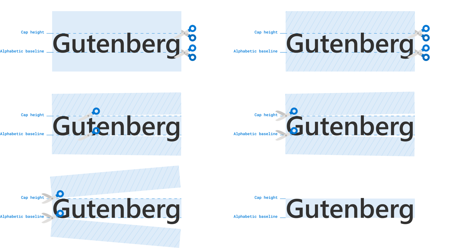
Used together, these properties trim the whitespace (known as leading) from above the first line of text and below the last line of text.
Using text-box-trim, you can trim from just the top (trim-start), just the bottom (trim-end) or both (trim-both).
button {
  text-box-trim: trim-both;
}
How much to trim?
text-box-edge accepts two values. The first value specifies where to trim at the above the text. The second value specifies where to trim below the text.
For trimming above the text you have an option of ex, cap or text. For trimming below the text you have a choice between alphabetic or text.
cap height refers to the height of a capital letter.
alphabetic will trim beneath the baseline (the baseline is the invisible line upon which letters sit).

button {
  text-box-trim: trim-both;
  text-box-edge: cap alphabetic;
}
In typographic parlance, the term x-height is the height of the lowercase “x” character in whichever font you are using.

button {
  text-box-trim: trim-both;
  text-box-edge: ex alphabetic;
}
See the Pen text-box-edge examples by Ollie Williams (@cssgrid) on CodePen.
The text-box shorthand property can set both text-box-trim and text-box-edge:
text-box: trim-both cap alphabetic;
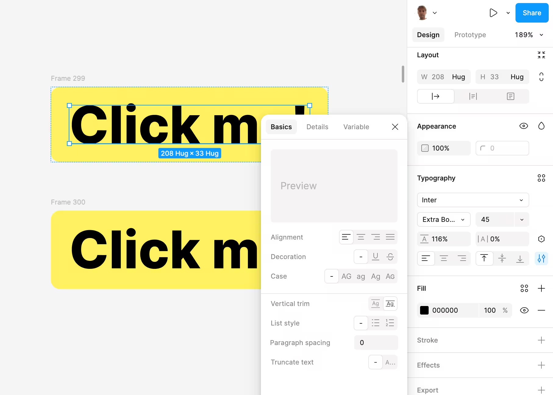
Figma has a control for what it calls vertical trim, which is equivalent to text-box-trim: cap alphabetic.

text-box-trim isn’t just for centering text. Here’s an example aligning the very top of some text to the top of an image:

Example title
text-box-trim: trim-start;
text-box-edge: cap alphabetic;
text-box-trim and text-box-edge are currently supported in Safari 18.2 and looks likely to reach Chrome and Edge relatively soon.
Whether text looks vertically centered partly depends on the context. Does the button text contain ascenders but no descenders? Or vice versa? All caps or only lowercase? Depending on the characters used, the same button can look either perfectly aligned or slightly squiffy.
That text-box-edge has so many potential values speaks to the fact that there is no foolproof boilerplate solution that works for all cases. Until this reaches broader browser support, we’re stuck manually offsetting by a single pixel or two using relative positioning or applying uneven padding whenever things don’t look quite right.