color-mix and relative color
Relative color
With the relative color syntax we can take an existing color and change its hue, saturation or opacity or make it lighter or darker.
Browser support: Safari has supported relative color since version 16.4. Chrome and Firefox have not yet implemented this feature. See caniuse.com for up-to-date support information.
Relative color and opacity
The question “How do I apply opacity to a CSS color variable?” has 493 up-votes on Stack Overflow. Before relative color there was no good solution to this question. Let’s look at this advice from the Tailwind docs as an example of how people currently approach the issue. If you’d like to define your colors as CSS variables and also want to be able to make use of Tailwind’s utility classes for reducing the opacity of colors, “you’ll need to define those variables as just the color channels”, the docs say. And so people end up with CSS variables that look like this:
:root {
    --color-primary: 255 115 179;
}
The upside of this approach is that you can use the same variable but specify a reduced opacity.
button:hover {
    background-color: rgb(var(--color-primary) / 50%);
}
The drawback is when you don’t need to define an opacity you’re still stuck with this horrible syntax:
button {
    background-color: rgb(var(--color-primary));
}
With the new relative color syntax we can define and use our color variables in the normal way but still have the option to change the opacity:
:root {
    --blue: #0ea5e9;
}

.bg-blue-half-opacity {
    background-color: rgb(from var(--blue) r g b / 50%);
}
See the Pen Modify opacity of a CSS Custom Property by Ollie Williams (@cssgrid) on CodePen.
We use from to specify the origin color (the color we want to base the new color on). The above example takes a hex color and uses it to create an rgb color. The origin color can be any kind of color — rgb(), hsl(), a named color like blue, etc.
Lighten, darken and more
Sass has color manipulation functions such as darken() and lighten(). With the relative color syntax it’s easy to achieve the same result and in a far more versatile way. It’s important to pick a color format that’s easy to manipulate. An rgb() function might be useful if you specifically want to change the amount of red or green or blue, but it’s pretty hard to work with otherwise. We could modify the hue, saturation, or lightness of HSL but oklch is a better option.
Each color channel can either be directly specified or taken from the origin color and modified using math functions like calc().
Example of setting the lightness to 20% but keeping the chroma (chroma means saturation) and hue the same as the origin color:
background-color: lch(from var(--color) 20% c h)You can create a whole range of different shades this way, all based on the same color:
See the Pen Tints and shades with relative color syntax by Ollie Williams (@cssgrid) on CodePen.
Alternatively you can take the lightness of the origin color and make it lighter or darker. By taking this approach, if the lightness of the origin color changed, the modified color would also change.
background-color: oklch(from var(--color) calc(l + .04) c h);See the Pen Relative color: adjusting lightness by Ollie Williams (@cssgrid) on CodePen.
Here’s an example that halves the chroma of the origin color but leaves the lightness and hue unchanged:
background-color: lch(from var(--color) l calc(c / 2) h); Directly specifying values for chroma can also work well to create variations.
See the Pen Chroma variations by Ollie Williams (@cssgrid) on CodePen.
User-defined color themes with relative color
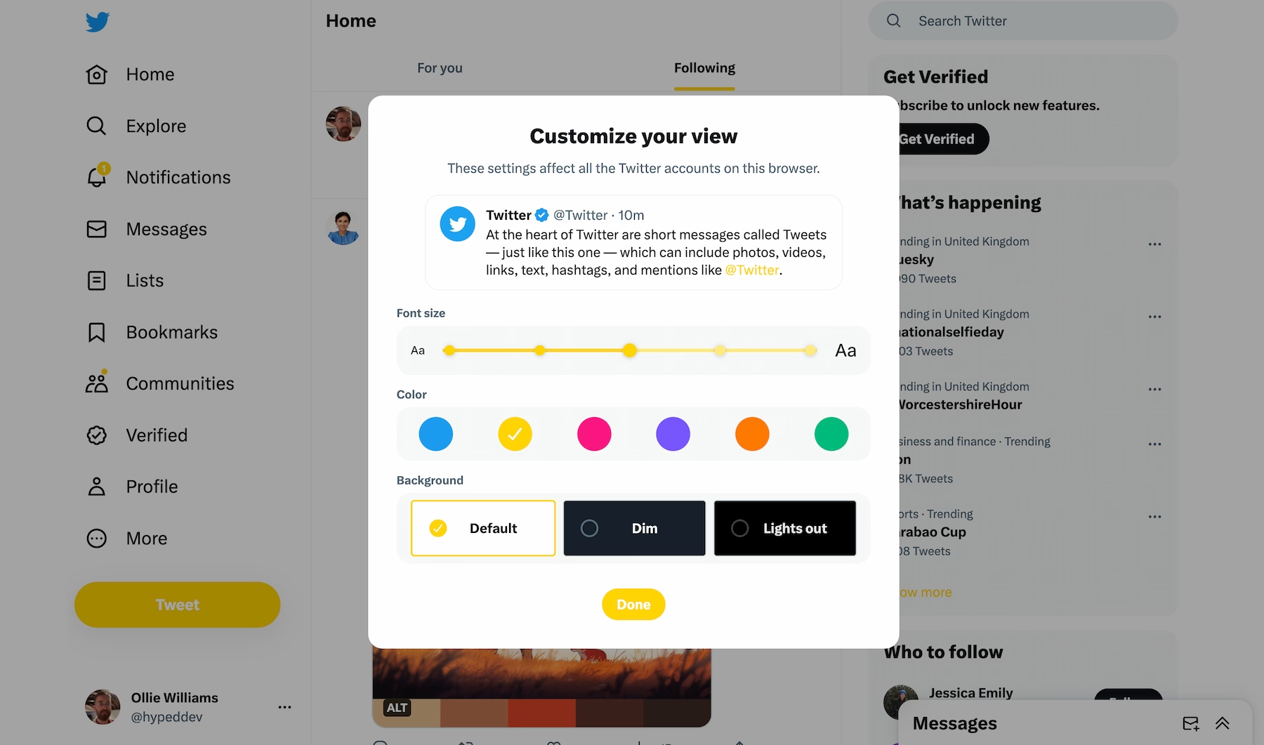
What no preprocessor could offer is the ability to create user-generated dynamic color schemes. Perhaps you want to give individual users more control over the color scheme of your website, like Twitter:
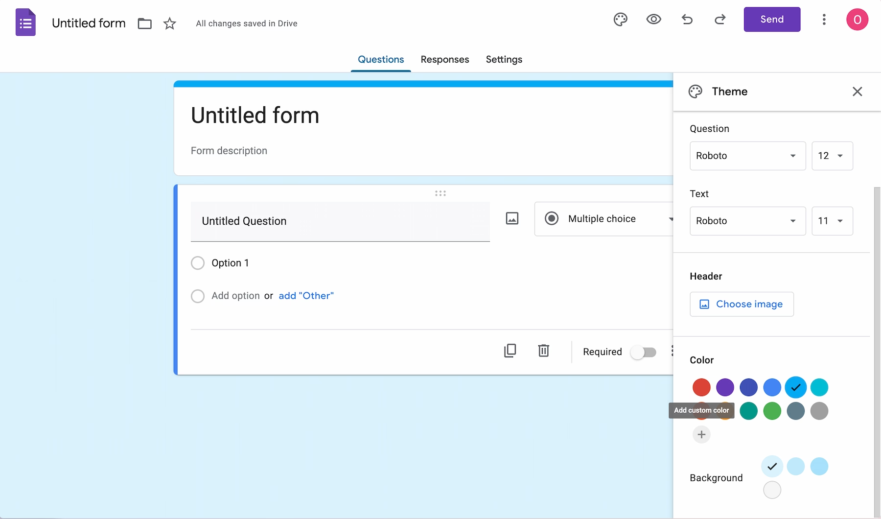
A more pragmatic use case is catering to businesses that want a website to reflect their brand. If a company was sending out a Google Form, for example, they might want to use their brand color.
Setting a custom property to reflect the value of a color picker was always trivial with JavaScript. However, building an entire color palette out of that single color was incredibly hard to achieve. Relative color syntax makes it easier.
You could easily set the styles for your UI elements using this approach.
The above example gives a rough example of what’s possible.
How do you prevent color contrast issues? Offering the user a limited set of colors to choose from (like Twitter does) rather than giving them free reign with a color input could solve this issue. If your users are businesses that want to use their brand color that isn’t a viable solution. A talk at CSSConf in 2018 about dealing with color contrast for user-defined colors involved installing an NPM dependency and setting the value of custom properties with JavaScript after doing various calculations. There are now easier approaches. The CSS Color Module Level 6 spec introduces the color-contrast() function but it’s only implemented in Safari Technology Preview. By itself, the color-constrast() function doesn’t completely solve contrast issues. Over certain background colors neither black nor white text is readable.
Relative color and math functions
You can use any CSS math functions — not just calc(). clamp(), for example, comes in useful to prevent colors from ever becoming too light or too dark.
.btn-light {
    background-color: oklch(from var(--theme-color) clamp(0.45, calc(l + 0.25), 0.99) c h);
}
For the background-color of the light button I’m bumping the lightness of the origin color up by .25 but preventing it from ever being fully white (if the user chooses a super light color) but also ensuring its never darker than .45 (so that it remains somewhat light even if the user chooses a dark color).
The min() and max() functions are useful if you only need to constrain the number in one direction:
oklch(from var(--theme-color) l min(.2, c) h) // prevent super-high chroma
oklch(from var(--theme-color) max(.4, l) c h) // prevent very dark colors
For the secondary and tertiary buttons I altered the hue. To change the hue you change the angle. There are a few ways to do this in CSS, but here’s an example using degrees:
.btn-secondary {
    background-color: oklch(from var(--theme-color) l c calc(h + 45deg));
}
There’s incredible flexibility in what you can do with relative color syntax. You could use the l value from the origin color to set the amount of chroma, or vice versa, for example.
color-mix
color-mix is now supported in all browsers. By default you’ll get a 50/50 mix of the two colors.
The following code would result in a color that was 70% blue and 30% black:
background-color: color-mix(in oklab, blue, black 30%);Specifying a percentage for both colors that amounts to less than 100% is a handy way to create semi-transparent colors with color-mix. The computed value of color-mix(in oklch, red 20%, blue 30%) would be oklch(0.522375 0.291007 314.124 / 0.5) (a shade of purple at half opacity).
When using color-mix() you have to specify a color space. Any of the following would be valid: lch, lab, oklch, oklab, hsl, hwb, srgb, xyz. The chosen color space can have a huge effect on the resulting color, as demonstrated below:
See the Pen color-mix color spaces by Ollie Williams (@cssgrid) on CodePen.
See this Twitter thread for some suggested use cases for color-mix.