A guide to CSS shapes and offset-path
The CSS offset-path property allows you to specify an invisible path for any number of HTML elements to be placed on. offset-distance moves elements along this path. The specification that defines the various offset- properties is titled Motion Path. It’s a misleading name as these properties can also be useful outside of animation. You can animate things along the path and you can animate the path itself but its also a handy way to position things statically. There’s nothing unique in how you animate these properties — you can animate offset-path and offset-distance with a CSS transition, a CSS @keyframes animation, or with the Web Animations API in JavaScript.
In order to show the path the element is moving along in the below Codepen I’ve included an SVG in the HTML with an identical path to the one I’ve used for offset-path.
See the Pen offset-path by Ollie Williams (@cssgrid) on CodePen.
There are several different ways to set a path. One option, the path() function, uses a syntax that you might recognise if you’ve looked at SVG code:
offset-path: path('M0,0 C40,160 60,160 100,0');The syntax might look somewhat inexplicable but you can copy and paste it right out of an SVG rather than writing it by hand.
<svg width="1192" height="325" fill="none" xmlns="http://www.w3.org/2000/svg">
<path d="M2 323c55-58 91-138 180-144 50-3 70 18 110 43C544 380 618-3 779 2s217 134 412 60" stroke="#000" stroke-width="2.3" stroke-linecap="round"/>
</svg>
Copy the path part of the SVG and use it in your CSS:
offset-path: path("M2 323c55-58 91-138 180-144 50-3 70 18 110 43C544 380 618-3 779 2s217 134 412 60");path() has been supported in all browsers for a while now (the information on caniuse is innacurate — path() has been supported in Safari since version 16). Other ways to specify a path are currently being implemented in browsers. Most of the CodePen examples in this article currently only work in Chrome Canary. Motion Path is part of Interop 2023 and is being actively worked on by Safari and Firefox so it’s likely that full support will ship in all browsers this year.
path() suffers from one major shortcoming: its not responsive. You can resize the SVG in a vector editing tool, copy the path of the resized SVG and use it to redefine the path in a media query, but the path is effectively a pixel value.
.squiggle {
  offset-path: path("M2 323c55-58 91-138 180-144 50-3 70 18 110 43C544 380 618-3 779 2s217 134 412 60");
}

@media (max-width: 500px) {
    .squiggle {
        offset-path: path("M1 87c15-15 24-37 48-39 14 0 19 5 30 12 67 42 87-60 130-59s59 36 111 16");
    }
}
If you want the path to grow and shrink as a percentage of the viewport size there are some horribly complex workarounds. Thankfully other ways of defining a path in CSS don’t suffer from this shortcoming.
The CSS clip-path and shape-outside properties use the same syntax for defining shapes so you might already be familiar with some of them.
circle()ellipse()— a circle that’s squished in one direction and stretched in the otherrect(),inset()andxywh(), each of which can be used to define a rectanglepolygon()for more complex shapesray()url()— to reference an SVG path or SVG shape- coord-box
circle()
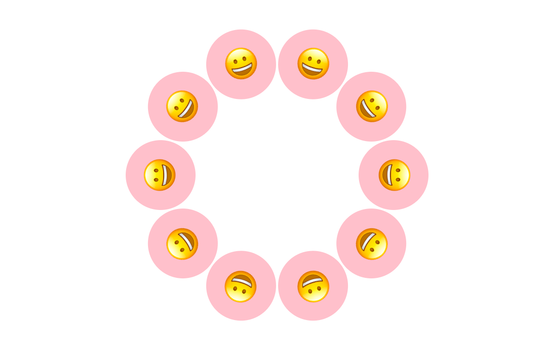
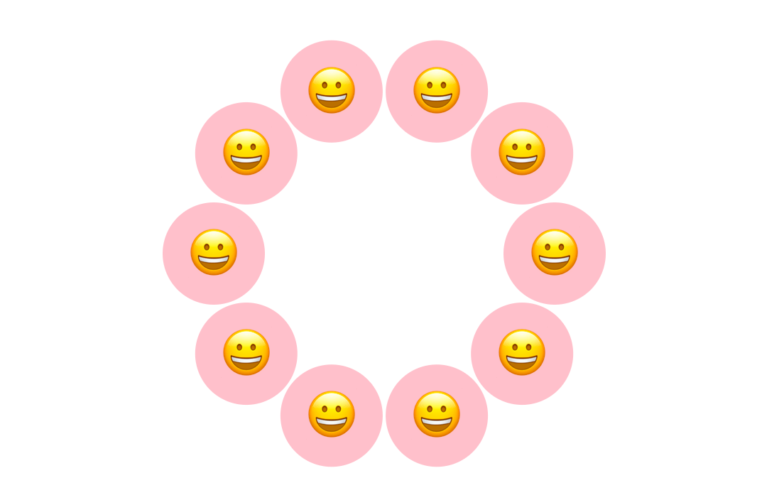
circle() takes two arguments: a radius and an optional position argument. The position argument defines the center of the circle.
.item {
  offset-path: circle(40px at center);
}
I’ve used pixels in the above example, but you can also specify a percentage or other length values.
Here’s a visualisation of some different position arguments:
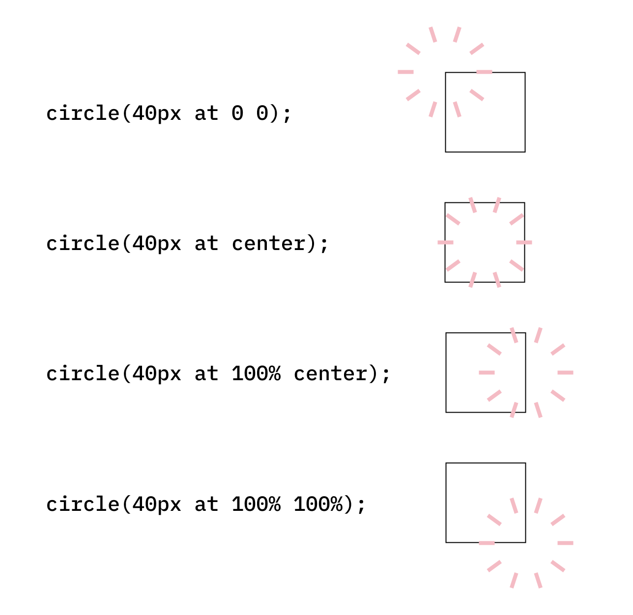
At an offset-distance of 0% an item will be placed on the right-hand side of the circle.
See the Pen Untitled by Ollie Williams (@cssgrid) on CodePen.
Here’s an example that animates both the radius of the circle() and the offset-distance of the items placed on the circle:
See the Pen circle() - animating offset-distance and offset-path by Ollie Williams (@cssgrid) on CodePen.
Here’s a demo of using circle() to create a fancy menu (this is a remix of a CodePen by Una Kravets).
See the Pen Radial Menu Popover remix using offset-path: circle() by Ollie Williams (@cssgrid) on CodePen.
ellipse()
The syntax for ellipse() is the same as circle() but you specify two radii instead of one:
offset-path: ellipse(40px 200px at center);inset()
Defines a rectangle via insets from each edge of the reference box. You can specify from one to four values.
Set all sides to be inset by 15%:
offset-path: inset(15%);See the Pen offset-path: inset() by Ollie Williams (@cssgrid) on CodePen.
Setting the top, right, bottom and left inset respectively:
offset-path: inset(10px 15% 5% 20px);Top and bottom at 15%, left and right at 0%:
offset-path: inset(15% 0%); inset() doesn’t follow the border-radius of the reference box but you can specify rounded corners for the path. Like the border-radius CSS property, you can specify anywhere from one to four values, depending on whether you want an equal radius for each side. You prepend this with the round keyword.
.parent {
  border-radius: 28px;
}

.thing-to-animate {
  offset-path: inset(-16px round 28px);
}
See the Pen offset-path inset() button by Ollie Williams (@cssgrid) on CodePen.
In the above example I’m matching the radius of the path with the border-radius of the element I want to animate around.
With inset() its possible to position the path outside of the element its animating around by using negative percentages, as shown in the above CodePen.
The starting position for offset-distance is the top left corner.
rect()
rect() requires 4 length arguments which define the position of the top, right, bottom and left edges of a rectangle, respectively. The top and bottom value are both insets from the top edge of the reference box. The left and right value are both insets from the left edge of the reference box.
You can optionally use the border-radius shorthand syntax to create rounded corners.
The starting position for offset-distance is the top left corner.
xywh()
xywh() is another option for creating a rectangle. The syntax is inspired by the SVG viewBox attribute. The first two arguments specify an inset from the left and the top, respectively, followed by the desired width and height of the rectangle.
offset-path: xywh(25px 25px 200px 200px);As with inset() and rect(), you can optionally use the border-radius shorthand syntax to create rounded corners.
offset-path: xywh(25px 25px 200px 200px round 20px);See the Pen xywh() offset-path by Ollie Williams (@cssgrid) on CodePen.
As with inset() and rect(), the starting position for offset-distance is the top left corner.
polygon()
polygon() can create all sorts of straight-edged shapes. Pairs of x y coordinates define each point of the shape. The simplest shape you can create with polygon() is a triangle:
offset-path: polygon(
    0% 0%, /* top left */
    100% 0%, /* top right */
    100% 100% /* bottom right */
  );
See the Pen Untitled by Ollie Williams (@cssgrid) on CodePen.
For a rectangle you would add one more pair of coordinates:
offset-path: polygon(
  0% 0%,
  100% 0%,
  100% 100%,
  0% 100%
);
For more complex shapes the code can start to look rather complicated. If you don’t want to write this out by hand there’s an online tool that can help. It brands itself as a “CSS clip-path maker” but seeing as the syntax for defining shapes is the same for offset-path and clip-path it works just as well for our use case. Firefox browser provides a great tool for editing shapes but doesn’t support using shapes for offset-path just yet.
While other units can be used to define these points, I’m using percentages so that the polygons are responsive. In the following example I’m using the same polygon for both clip-path and offset-path. As you can see, the shapes are fully responsive and resize depending on the width of their container.
See the Pen polygon() offset-path and clip-path by Ollie Williams (@cssgrid) on CodePen.
You can also animate the points of the polygon():
See the Pen polygon() animation by Ollie Williams (@cssgrid) on CodePen.
url()
Looking back at my whale example from earlier, I had an inline SVG in my HTML and used the same path as the SVG for offset-path using path(). url() is a cleaner option that saves us having to duplicate the path.
Add an id to whichever part of the SVG you want to reference:
<svg width="610" height="216" viewBox="0 0 610 216" fill="none" xmlns="http://www.w3.org/2000/svg">
<path id="squiggle" d="M1.5 83.9777C1.5 159.985 69.5106 183.452 154.064 183.452C236.902 178.856 294.681 53.8638 209.367 83.9777C133.285 120.676 166.19 205.338 236.902 213.799C305.875 222.053 312.574 157.661 328.889 106.821C345.82 54.0581 370.867 13.7526 428.473 2.03607C473.965 -7.21664 534.556 71.326 609 20.7776" stroke="white" stroke-width="1.14771" stroke-linecap="round" stroke-dasharray="9.65 9.65"/>
</svg>
You can then reference that path in CSS:
.item {
      offset-path: url(#squiggle);
      }
ray()
Unlike the other values listed in this article ray() only works as a value for offset-path — you can’t use it with clip-path or shape-outside.
The spec says:
The ray() function defines an offset path as a straight line emerging from a point at some defined angle.
You can read more about it on MDN.
coord-box
Can be one of content-box, padding-box, border-box, fill-box, stroke-box or view-box. This value can be specified by itself or together with a shape. Any of the following should be valid:
offset-path: padding-box;
offset-path: content-box;
offset-path: inset(5%) content-box;
offset-path: circle(40%) padding-box;
offset-path: polygon(0% 0%, 100% 0%, 100% 100%) border-box;
It will automatically respect the border-radius of the element.
For the following example I exported an animation from Adobe After Effects as a mini video. I’m setting the offset-path to border-box so the video moves along the edge of the button.
Now that I’ve covered all the different ways to define a path, let’s look at the other offset- properties.
The other offset- properties
Browser support
The offset-anchor, offset-distance, offset-position, and offset-rotate properties are all supported in Safari since version 16, contrary to the innacurate information on caniuse and MDN.
offset-distance and offset-rotate have full cross-browser support.
offset-anchor should be landing in Chrome 116. It is already in Firefox and Safari.
There is still no support for offset-position in Chrome or Firefox so I won’t cover it in this article.
offset-rotate
By default, the orientation of the items placed along a path is determined by the direction of the path:
With offset-rotate you can control the angle at which the items are displayed. By applying offset-rotate: 0deg; each item will keep the original orientation it would have had if it wasn’t on a path.
offset-anchor
By default it is the center of the element that moves along the path, as seen in the below screenshot:
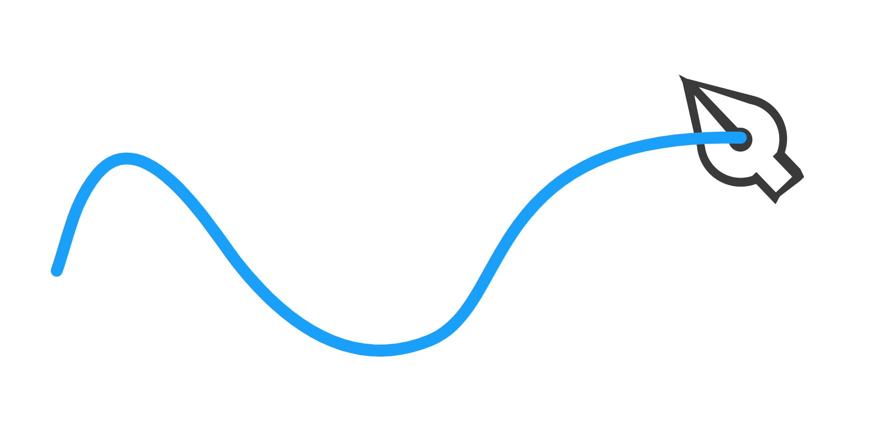
In the following example I wanted the nib of the pen to move along the path so I changed the anchor to be the top left:
.pen {
      offset-anchor: top left;
  }
See the Pen offset-anchor and stroke-dashoffset by Ollie Williams (@cssgrid) on CodePen.
Side note that has nothing to do with offset-anchor: When working with SVG you can combine offset-path with a stroke-dashoffset animation for a nice effect, as shown above. This article on CSS Tricks has a decent explanation.
Further reading
- Motion Path spec
- CSS Shapes spec
- CSS shapes on MDN
- Ahmad Shadeed on CSS Shapes in the context of
clip-path - Get Moving (or not) with CSS Motion Path by Dan Wilson
Trigonometric functions in CSS are now supported by all browsers. If you want to read about using them in conjunction with CSS shapes, be sure to read Dan Wilson’s article on the topic.
Some fun examples of path() from around the web:
- rollercoaster
- a simple modal example
Motion Path isn’t the only way to create this sort of effect. I already mentioned stroke-dashoffset. Rauno Freiberg, a design engineer at Vercel, took a different approach for an animation on the Next.js website.
This works by animating the x1, x2 and y1, y2 values on a <linearGradient /> SVG tag. The gradient is then used as a stroke on a <path />.
— rauno (@raunofreiberg) April 13, 2023
Initially tried using CSS Motion Path with promising results, but unfortunately it didn't work well when moving around curved edges.