System font deep dive
It’s still relatively common to see a giant font stack aimed at selecting the system font of each different platform:
font-family: -apple-system, BlinkMacSystemFont, "Segoe UI", Roboto, sans-serif;The CSS keyword system-ui as a value for font-family has been supported by all browsers for years, so the above code is no longer necessary. Additionally, Safari also supports the keywords ui-monospace, ui-rounded, ui-sans-serif, and ui-serif. In the words of the CSS Font Spec, system fonts “allow web content to integrate with the look and feel of the native OS”. More importantly, they’re great for performance, and some of them look better than most of what you’ll find on Google Fonts.
Which typefaces do these keywords select on the different operating systems? Let’s take a look.
macOS, iOS, iPadOS
On Apple devices, all the system fonts are variable fonts.
system-ui and ui-sans-serif
ui-sans-serif and system-ui both select the same font: SF Pro. SF Pro is one particular variant of a typeface called San Francisco. SF Pro has a weight axis, a width axis and an optical size axis, offering a huge amount of typographic versatility.
font-family: ui-sans-serif, system-ui;
font-stretch: 150;
font-weight: 1;
font-optical-sizing: 96;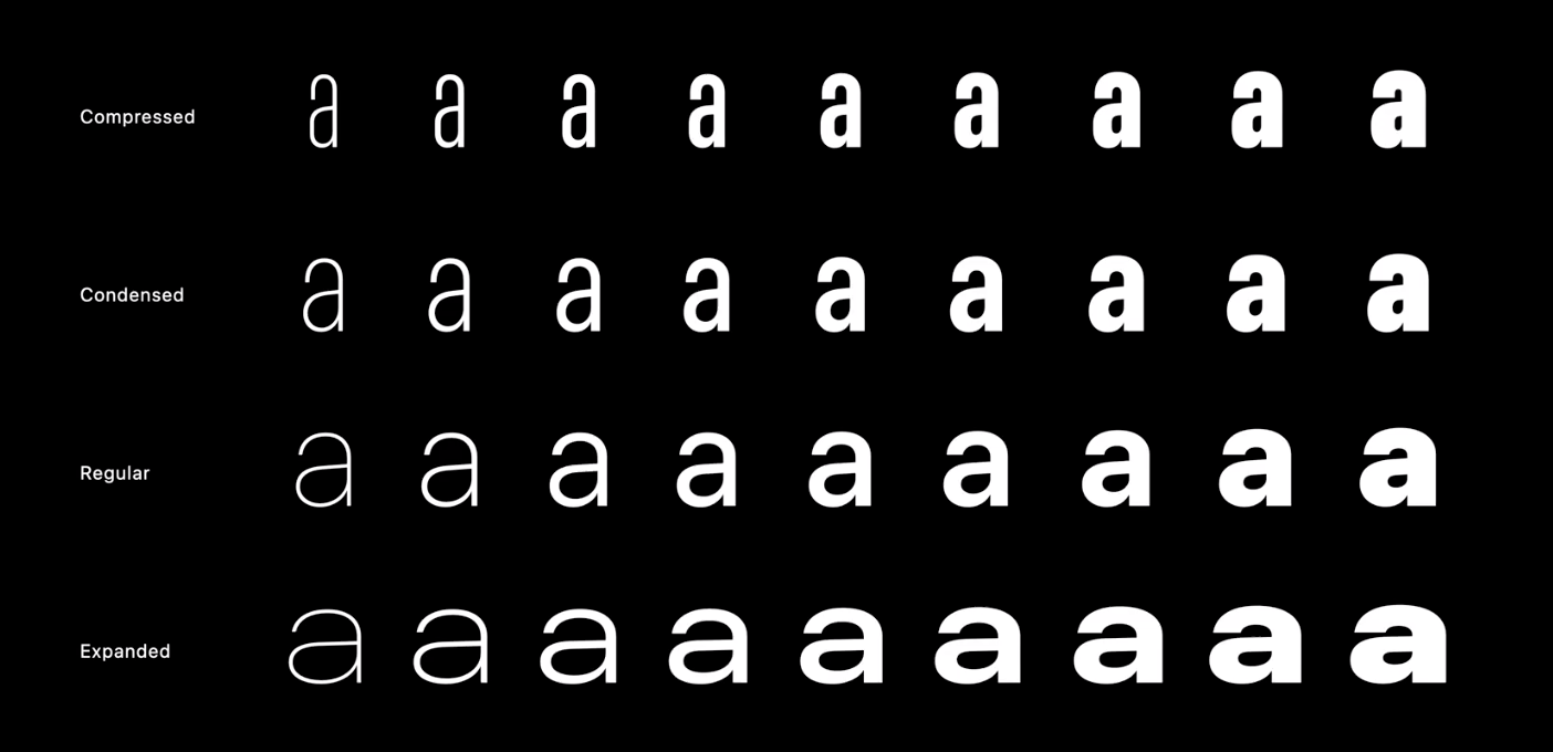
There’s also a grade axis which can be adjusted using the font-variation-settings CSS property:
font-variation-settings: "GRAD" 400;
Grade is similar to weight. Increasing the weight of a font makes the text wider. Increasing the grade makes the letters thicker without changing the width of the text.
ui-serif
ui-serif maps to New York. New York offers a weight axis, an optical size axis and a grade axis.

ui-rounded
ui-rounded maps to SF Rounded. It has a grade and a weight axis.

ui-monospace
ui-monospace maps to SF Mono. This is generally used for displaying code. It has a weight axis and a YAXS axis. YAXS makes the font vertically thicker. The YAXS axis can be adjusted using the font-variation-settings CSS property.

The whole point of system fonts is that they’re already on the users operating system, but if you need to download any of these typefaces to use in design software like Figma, they’re available from Apple here.
If you’re viewing this page using Safari, you can view all the above typefaces here.
Windows
Windows uses Segoe UI as its system font. Windows 11 added Segoe UI Variable, a variable version of the typeface, but sadly this version is not used when you specify the system-ui keyword. According to this blog post by a Microsoft employee, it is possible to access the variable version by explicitly specifying the name of the font. e.g:
font-family: 'Segoe UI Variable Display', system-ui;
You can download Segoe UI and Segoe Ui Variable from Windows here.
No browser on Windows supports ui-monospace, ui-rounded, ui-sans-serif or ui-serif.
Android
The open-source font Roboto is used on Android phones. Roboto Flex, a variable version of the typeface, has been publicly released.
Unfortunately, this is not used when you specify the system-ui keyword. I opened a bug that you can star here.
Roboto can be downloaded from Google Fonts here.
No browser on Android supports ui-monospace, ui-rounded, ui-sans-serif or ui-serif.
Legal considerations
While Roboto is open-source and can be freely used for anything on any platform, that isn’t the case for Segoe UI or any of the Apple fonts. The licence from Apple states: “you may use the Apple Font solely for creating mock-ups of user interfaces to be used in software products running on Apple’s iOS, iPadOS, macOS, tvOS or watchOS operating systems, as applicable”. The license for Segoe UI says you may use the font “solely to design, develop and test your programs that run on a Microsoft Platform”. You can’t use it in an @font-face declaration.
Conclusion
The obvious drawback of system fonts is that your website will look different on every operating system. The font-size, letter-spacing, width and weight you carefully select on one platform may not look ideal when another font is used on a different platform. You can make use of ultra-condensed and expanded versions of SF Pro, for example, and it’ll look great, but there’s currently no way to recreate that look with Segoe or Roboto. You’ll need to do a lot of cross-device testing if you’re going to take this approach. Perhaps the performance factor makes it worthwhile.